JB Skrub
UI/UX reimagined
jbskrub.com
Background
JB Skrub is a skincare brand founded by Julie Bowen and Jill Biren. Julie, an accomplished actress known for her role as Claire Dunphy in "Modern Family," and Jill, with her extensive experience in publishing, recognised a gap in the skincare market for young men. Inspired by their own pre-teen sons, they aimed to create an effective yet approachable skincare line for tween boys that wasn’t too childish or intimidating.
The journey began with a simple conversation and led to three years of meticulous product development. By January 2023, JB Skrub launched with five carefully crafted formulas, all certified compliant with European Union standards for clean skincare.


The old JB Skrub website
Objectives
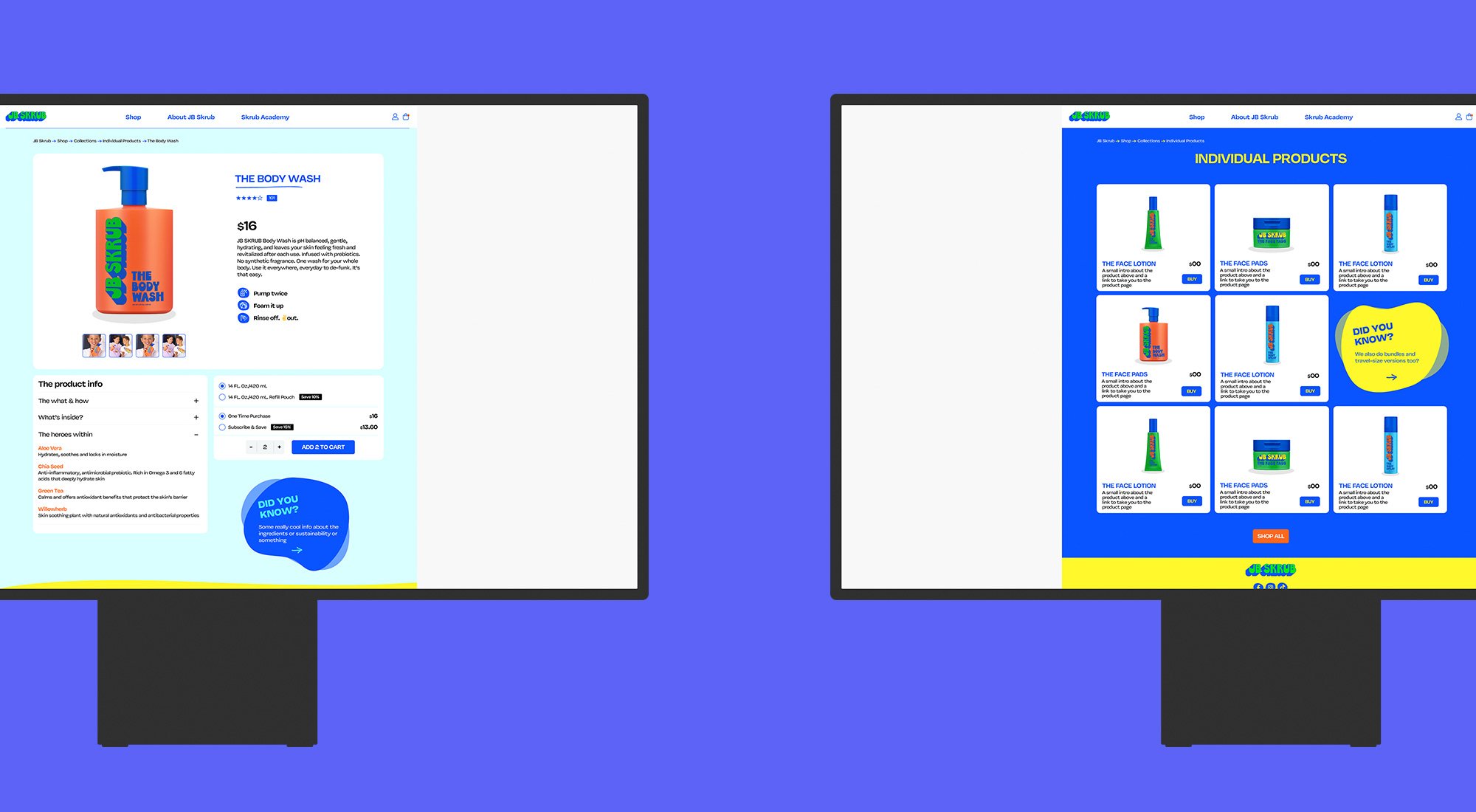
The main goal was to reimagine the JB Skrub website to make the most of the brand’s vibrant color palette, unique typefaces, and limited photography. The target was to engage a diverse audience, particularly tweens and their mothers, who are often the buyers of skincare products for tween boys.
Better utilisation of brand assets: Leverage existing brand assets for a more engaging and contemporary website experience.
Appeal to a changing audience: Ensure the website resonates with both tweens and mothers, the primary buyers of JB Skrub products.
Challenges
The project faced several challenges:
Reimagining for a different audience: Redesigning the website to appeal to a different demographic while maintaining the brand's visual identity.
Preserve the brand essence: Adapting to a broader audience without diluting the brand's core identity.

Solutions
Comprehensive brand analysis: A thorough review of JB Skrub's brand assets, including its bright color palette, unique typefaces, and limited photography, formed the basis of the redesign process.
User-Centric Design: Focused on creating a user-friendly experience that appeals to both tweens and mothers. This involved incorporating vibrant colors and playful imagery for younger audiences, along with providing information and reassurance for parents.
Enhanced brand identity: The bright color palette and unique typefaces were prominently featured, and limited photography was strategically used to complement the brand's youthful and approachable aesthetic.
Interactive elements: Quizzes and product demonstrations were added to engage users and provide a more immersive experience.
Results
Enhanced user engagement: The redesigned website successfully engaged a broader audience, including tweens and mothers, with its visually appealing and user-friendly interface.
Preserved brand essence: The website retained the youthful and approachable identity of JB Skrub.
Improved conversion rate: The user-centric design and enhanced visual identity led to higher conversion rates, with more visitors engaging with the website and making purchases.
Future Outlook
With the successful redesign, JB Skrub is well-positioned to continue meeting the skincare needs of young men while also appealing to their parents. The user-centric approach and effective use of brand assets ensure the website remains relevant and engaging as the brand grows. As JB Skrub expands its product offerings and reaches new markets, the redesigned website will be a valuable tool for connecting with customers and driving sales.
